Easy Insurance Quotes
Small changes, big improvements
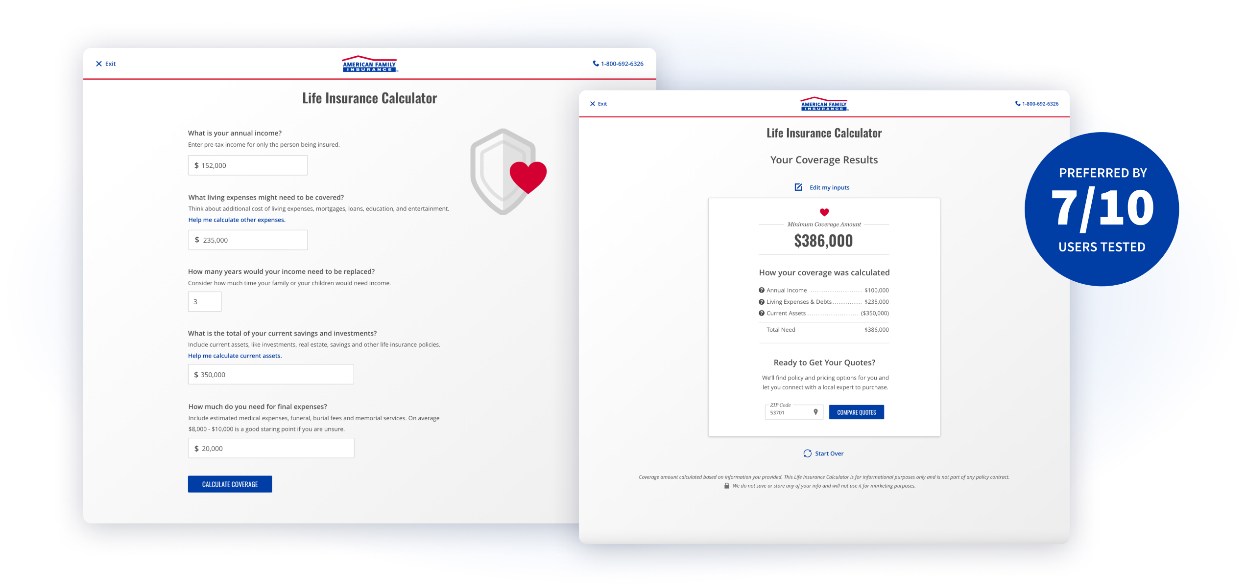
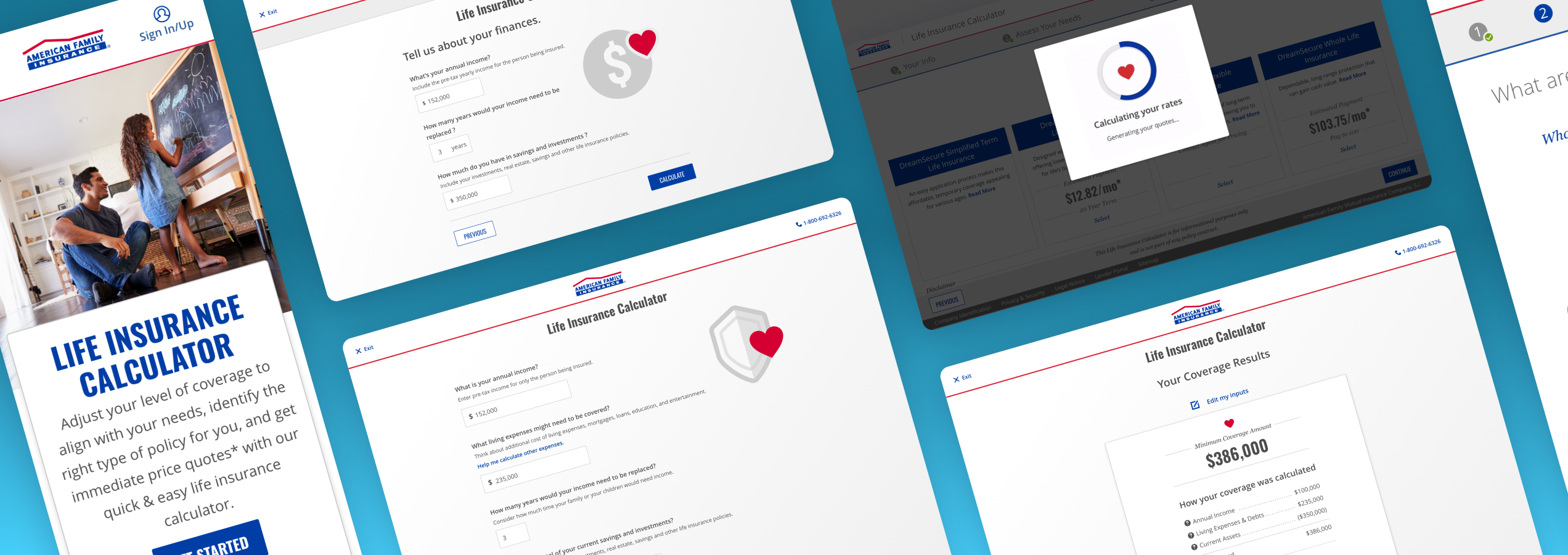
Life insurance feels complicated, but it doesn’t have to be. Consumers often struggle to know how much coverage is right for them. I improved the experience of a life insurance calculator app for American Family Insurance to provide consumers with an easy, educational and way to get price quotes, fast.
Project Highlights:
- Decreased drop-off rates
- Increased completion and conversion rates
- Small changes with very little development effort created large results
Project Roles
Product design // Heuristic analysis // Content strategy // User testing & research // UX & UI
The Problem
The life insurance calculator app is helpful to consumers researching life insurance and looking for online quotes. But, customers were not completing the app’s workflow and most were not making it to the price page. For the users that did see a pricing page, conversion was low. Only about 3% of consumers were taking action and contacting an agent. The life insurance team was concerned about the number of leads coming from the app.
Project Goals:
- Improve completion rate of life insurance quote requests
- Increase conversion rate
- Focus on easy changes we could make quickly with minimal development
Research & Discovery
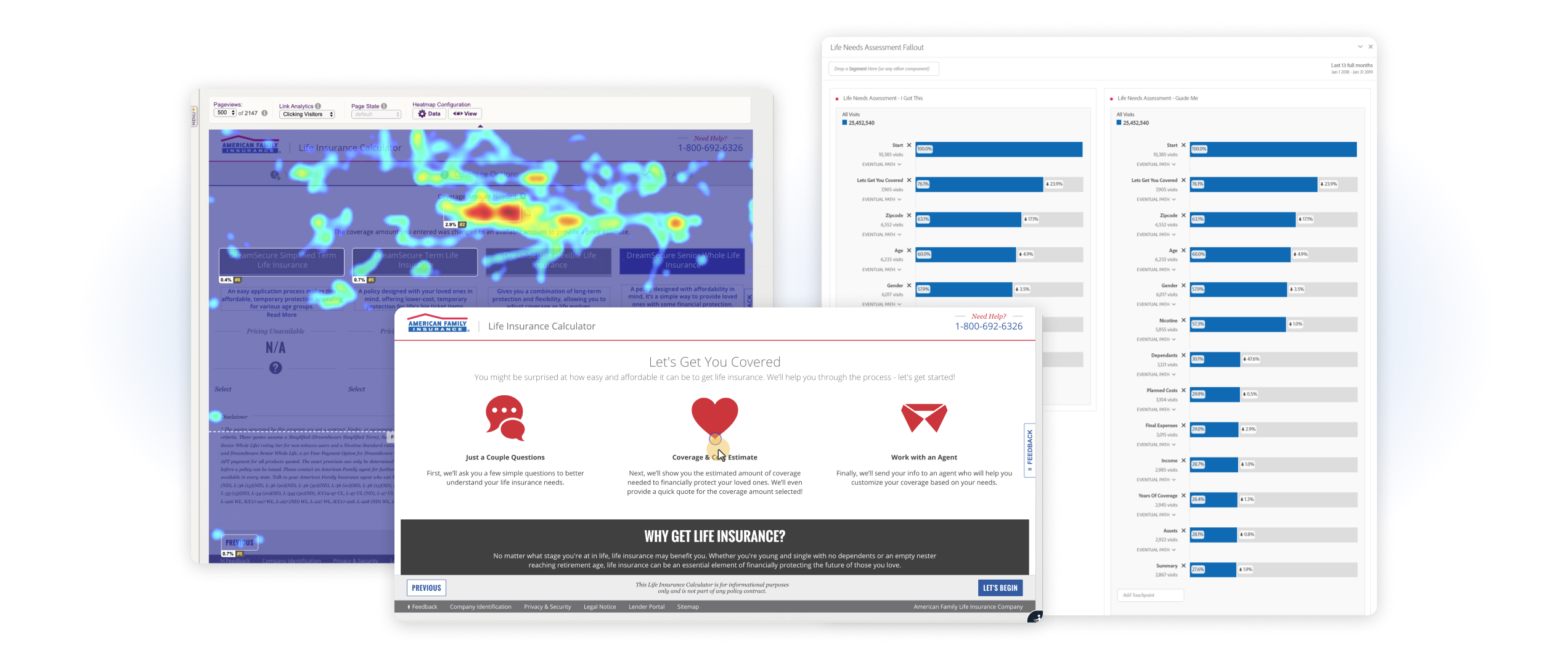
To kick off the discovery process, I started by gathering data. I reviewed behavioral data via session replays and heatmaps from ContentSquare. I also pulled historical performance data from Adobe Analytics. I looked at our conversion rates, analyzed user paths and workflows, and took a look at drop-off data.
Experience Testing
After reviewing the data, I performed quick, basic unmoderated user testing to gather baseline feedback. I created an unmoderated user test using usertesting.com and synthesized videos from 5 desktop users and 5 mobile users. The findings from the data analysis and the user testing and feedback helped highlight key areas to focus on for the design phase:
- User workflows — several pages were confusing and responsible for high drop-offs
- Performance — long load times for 80% of users
- Comparing policies is confusing — users struggled to compare and were navigating away from the summary page
- Low need scenarios were not covered in the app
Designs
Workflow adjustments
The life insurance calculator app had an “intermission” screen that was intended to educate users about life insurance. It was content heavy, overwhelming, and cause confusion. About 45% of users were dropping out of the experience on just the second screen! By removing this screen, the app’s flow felt more natural to users and keeps them moving on, focused on the task at hand.
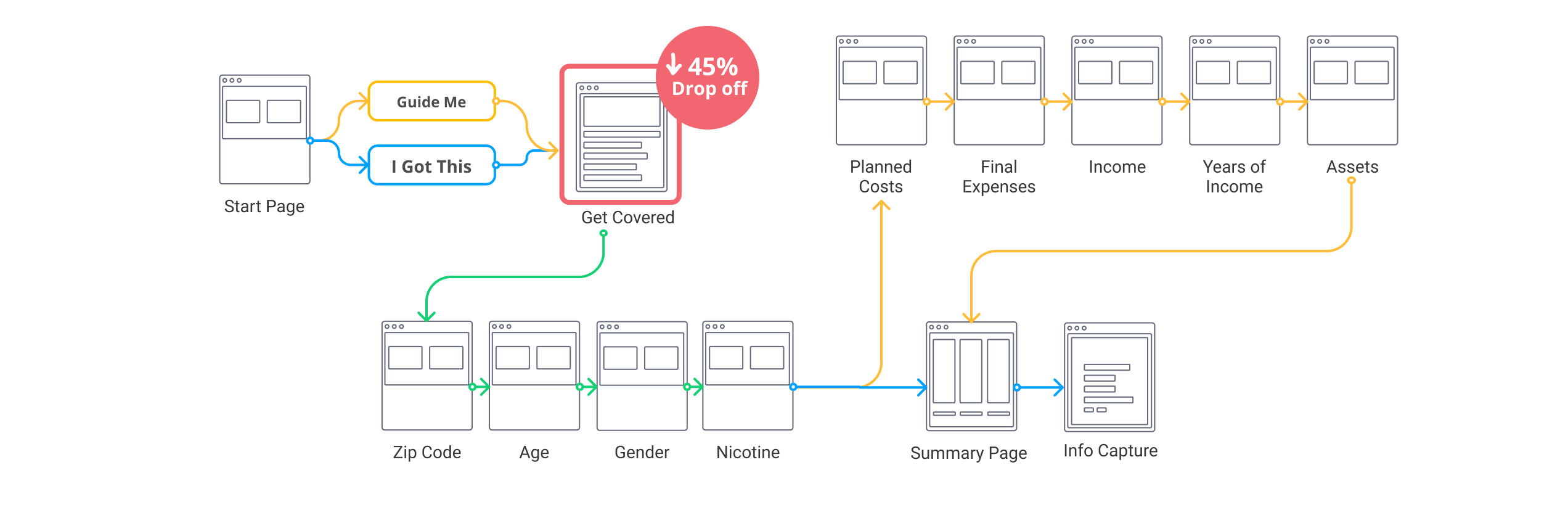
The app's user flow shows that 45% of users were dropping off at the second screen. Removing this screen improved the completion rate.
Improving Performance
To deal with the performance issues I was seeing in the user tests, I shared some example videos with my development and engineering team. This allowed them to start reviewing the API for the coverage rates. They did end up finding an issue in the code that was causing the API to hang. As a backup solution I proposed an informative loading animation to cue users that the experience was loading and not broken.
Comparing Policies
If consumers made it to the summary pricing page, they were seeing options that were not easy to compare. To learn more about each policy type, they had to click a link that navigated them away from the app entirely. Users were not returning to the summary page. I designed an updated summary page that focused on providing users information they needed to compare policy types without leaving the page. I also added a way for users to email the information to consider later, because many shoppers need time to take action. We’d have another metric to help us track conversion rates.
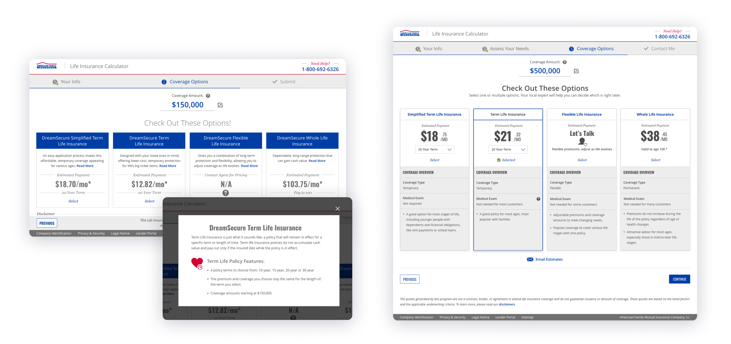
Left: Before screens showed little info about the policy options without requiring users to take an additional action. Right: New summary page includes content that helps user compare policies without clicks.
Low Coverage Scenarios
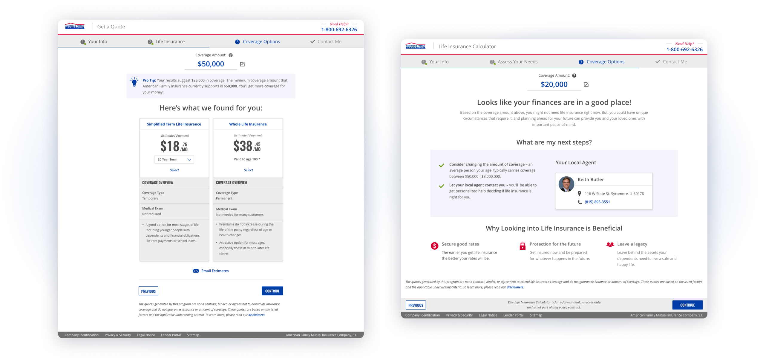
One insight that came from reviewing session replays, was that a good number of users were encountering low coverage need scenarios. The app did not cover this user need. Instead, all options appeared in a disabled state, with no interactive options and no explanation for these results. By expanding the app to cover these scenarios, it now gives the user options and ensures that there are more actions for them to pursue instead of a dead end.
Results
With a tight timeframe, low budget and lack of development resources, not all of the design recommendations were implemented. I prioritized the ones that we could most fully implement and still got great results!
- Drop-off rate decreased by 27%
- Improved tool completion rate by 18%
- Conversion into a lead increased by 11%
What's Next
I continued working on new designs to create a North Star for this app to work toward for the future. I had designed and tested several new concepts, and found experiences that better resonated with users. My focus was on shortening the process and making the experience more modern and engaging.
